Greg Curnoe’s “I Tell Stories”

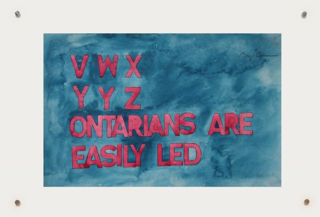
35 years ago this week Greg Curnoe was working on his seminal series of large-scale watercolour & stamp pad ink text-based paintings. He was working towards a Fall solo exhibition at the YYZ Gallery, Toronto titled “I Tell Stories”.
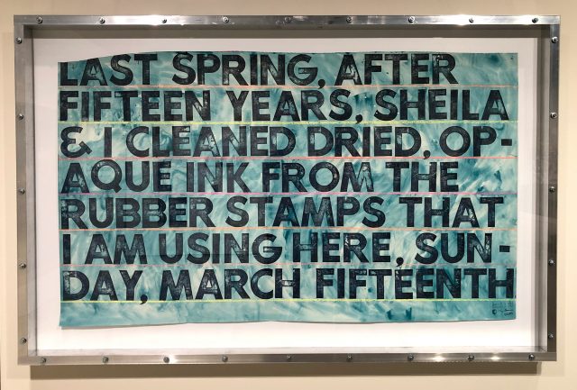
This exhibit, which included “Animated Conversation #2” and “Provincial Poem” (seen below), symbolized Curnoe’s re-emergence in the Canadian art scene. The text-based watercolours from 1985-1987 were now seen within a conceptual framework and postmodern discourse of the time. Curnoe was free again to create vivid works about his everyday life filled with poetic phrases and witty observations.
“…by using a stamp set of big letters and also by using a sans serif typeface I have made the text awkward to read. I discovered that a sans serif typeface isn’t as legible as the more traditional serif faces. In other words, the letters stick out, they don’t disappear. It makes you look and read at the same time. That seems to be what this work is about. The reading is done more slowly, and you have to look to read. You can’t just take it in, partly because the letters are very large. Some letters are upside down or backwards. But because the letters are in correct sequence you can read it.” Greg Curnoe
In making these works in the mid 1980s, there was a significant shift from Gary Michael Dault’s 1978 comment that Curnoe’s work was “insufferably, languishingly, narcissistically boring”. Instead of abandoning his beloved text, Curnoe embraced his stamp pads and began making work that still has resonance today, 35 years later.
 In 1987 Greg asked: “Are you going to be able to see my show at the YYZ or will I have to describe it to you? – since it’s all texts and poems I could send them to you – but since they are also paintings, I can’t”.
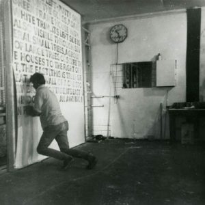
(Left: Pierre Theberge photographed Greg in 1968 stamping “Victoria Hospital, First Series #1”, his monumental series that used words to describe what was going on outside of his studio window.
